Yerba Buena Center for the Arts
After pandemic closures and changes in leadership, Yerba Buena Center for the Arts is refocusing on its founding purpose: to bring the communities of San Francisco together in celebration of culture and creativity.
As Director of Marketing and Communications, I’m responsible for attracting new audiences, improving awareness, and driving essential revenue goals (such as membership sales, corporate venue rentals, and exhibition attendance).
ATTRACTING RECORD-BREAKING CROWDS
Nick Dong: 11 to 88 was the first exhibition that I shaped from the outset—and it became the most successful show at YBCA in nearly a decade.
An immersive solo show by a Taiwanese-American technologist, for the exhibition I developed a rigorous messaging hierarchy, leading with a compelling ‘why’ rather than a descriptive ‘what.’
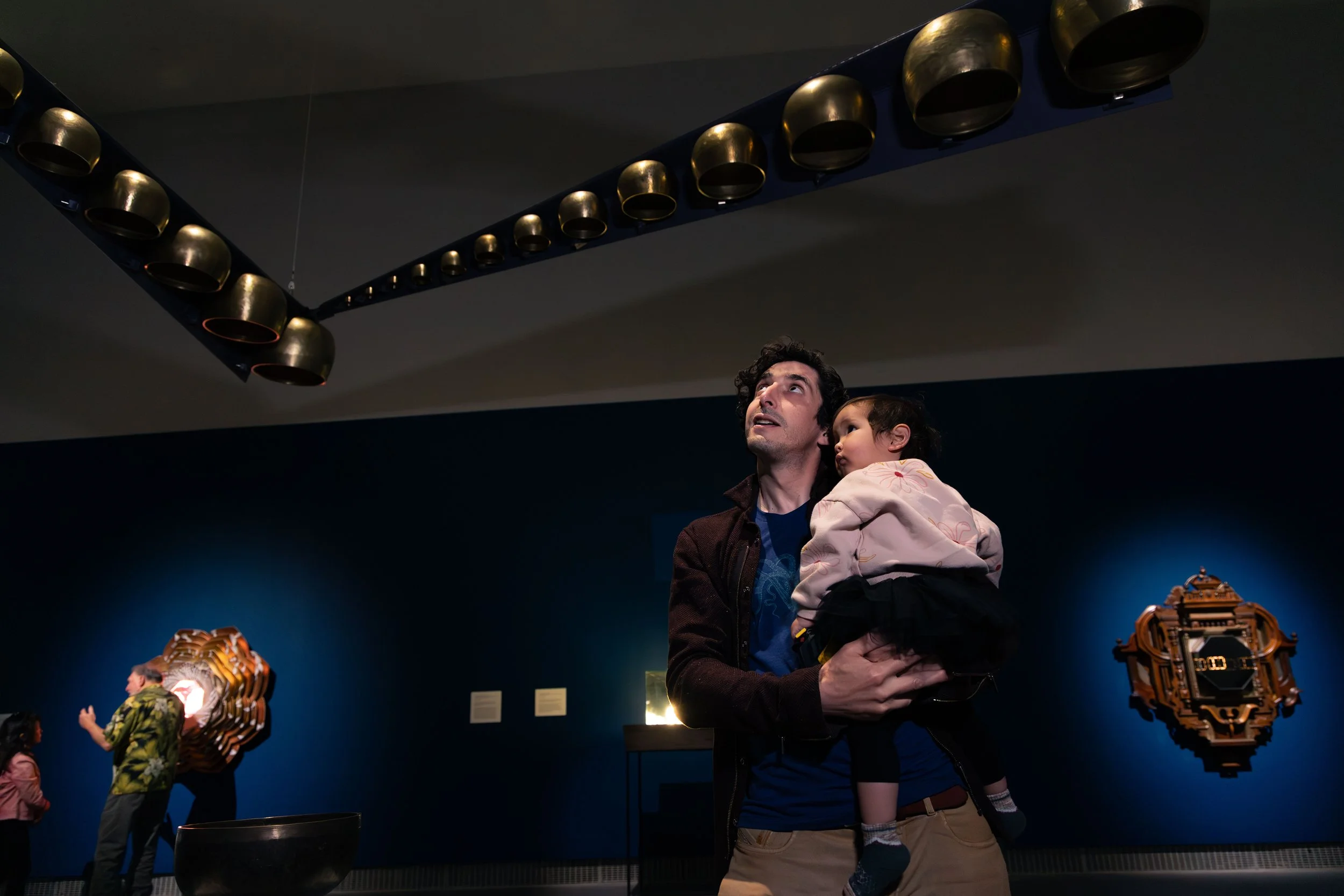
Our beautiful photography of visitors enabled us to market a total experience of wonder (using fewer words and more images whenever possible).
Collaborations with social media influencers helped reach a younger demographic that had heard of YBCA, but never visited.
During the course of the exhibition, persistent resharing of user-generated content sustained buzz and drove additional attendance via word-of-mouth.
Tactical listings on syndicated ‘local event’ websites and ‘free things to do’ helped reach curious audiences who weren’t regular visitors to art galleries.
The result was YBCA’s best-attended show in almost a decade: averaging 3x the weekly attendance of recent shows, at less than 10% of prior advertising budgets. The exhibition’s success was a case study in clarity and consistency in creative—as well as tactical resourcefulness.
BECOMING A VISITOR-FIRST ORGANIZATION
Beyond individual exhibitions, I redirected marketing and communications strategies to focus on a visitor-first perspective.
This included everything from exterior signage (more succinct and accessible), out-of-home advertising (bold and enticing), and use of photography (showcasing a visitor POV).
In this same spirit, I led overhauls of our website and digital properties: cleaning up hierarchy, radically reducing explanatory copy, and putting dynamic artwork front and center.
These improvements were made consistent from online to offline, with revised on-site wayfinding which I developed. I also clarified the messaging around our educational programs, which drove a sustained improvement in attendance from families, students, and retirees alike.
Taken together, these efforts helped steadily increase visitation, better engaged our community, and kept our spaces lively throughout the year.
CREDITS
Strategy, copywriting, and creative direction: Chris Royalty
Design: MacFadden & Thorpe, Halina Mader
Photography and Videography: Corey Marsau
Social & content: Brooke Vlasich
Email & web: Amelia Mafflin


